
Work
About
Contact
WERASH
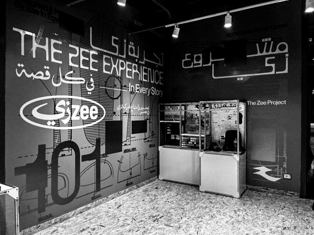
Zee
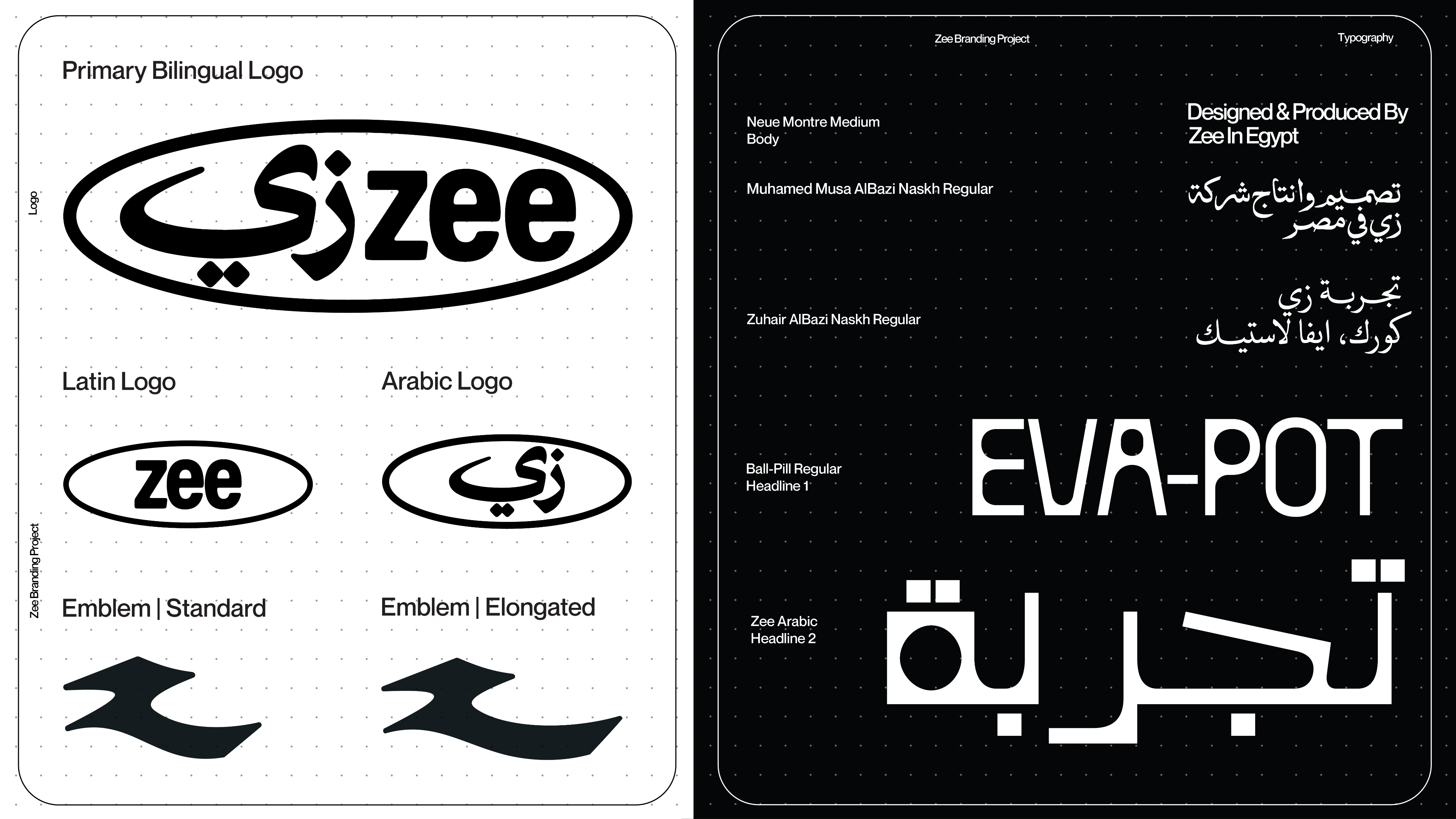
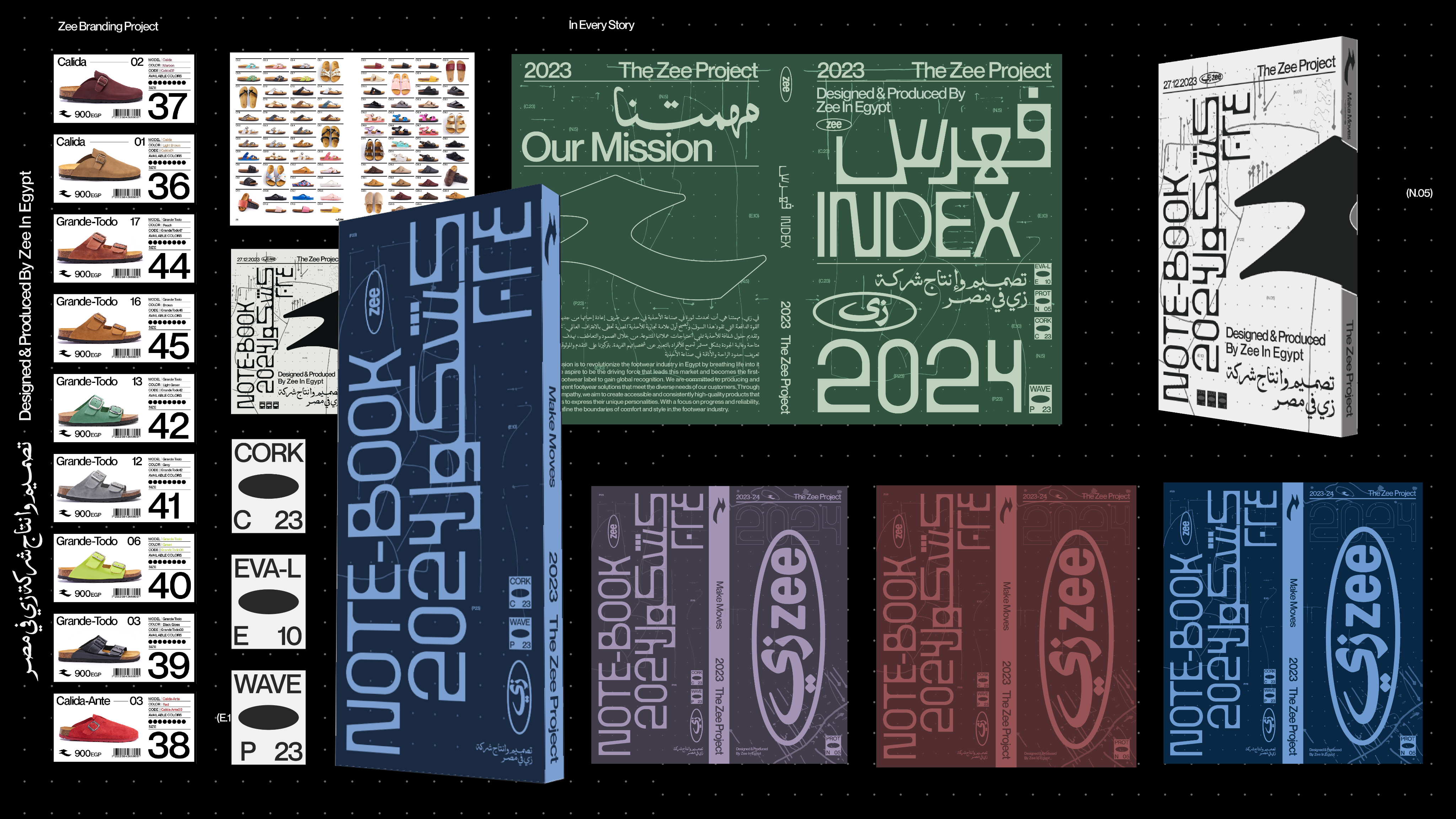
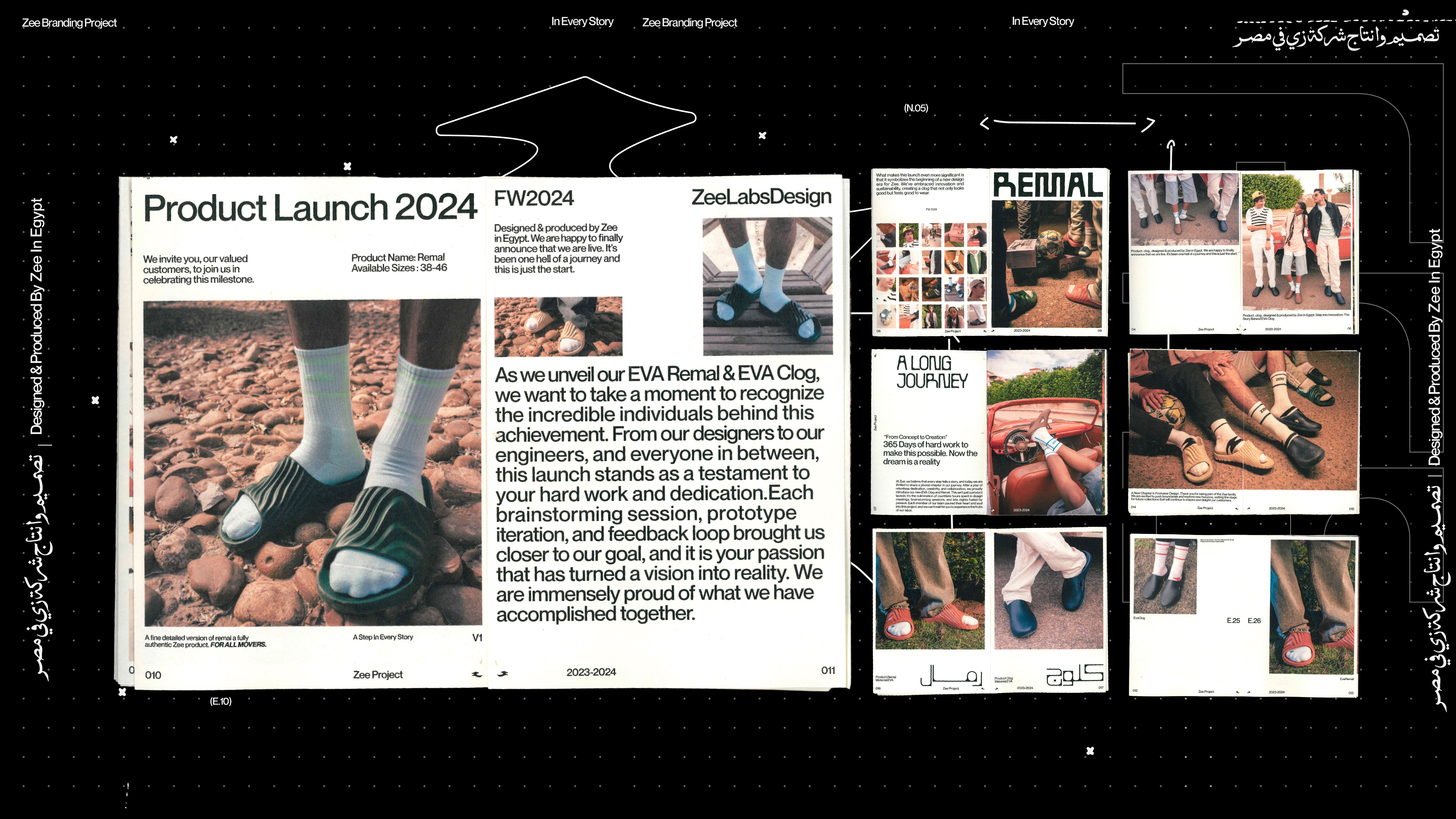
Zee is a Cairo-born footwear label that marries performance-driven design with timeless aesthetics. Built for creators, athletes and everyday movers, the brand frames shoes as tools for expression — comfortable, durable, and unmistakably original — rooted in a proudly Egyptian perspective.

Challenge:
The market forced a trade-off between comfort and character. Zee needed a product and brand logic that delivered genuine ergonomic benefits while remaining culturally expressive and easy to navigate for shoppers.
Solution
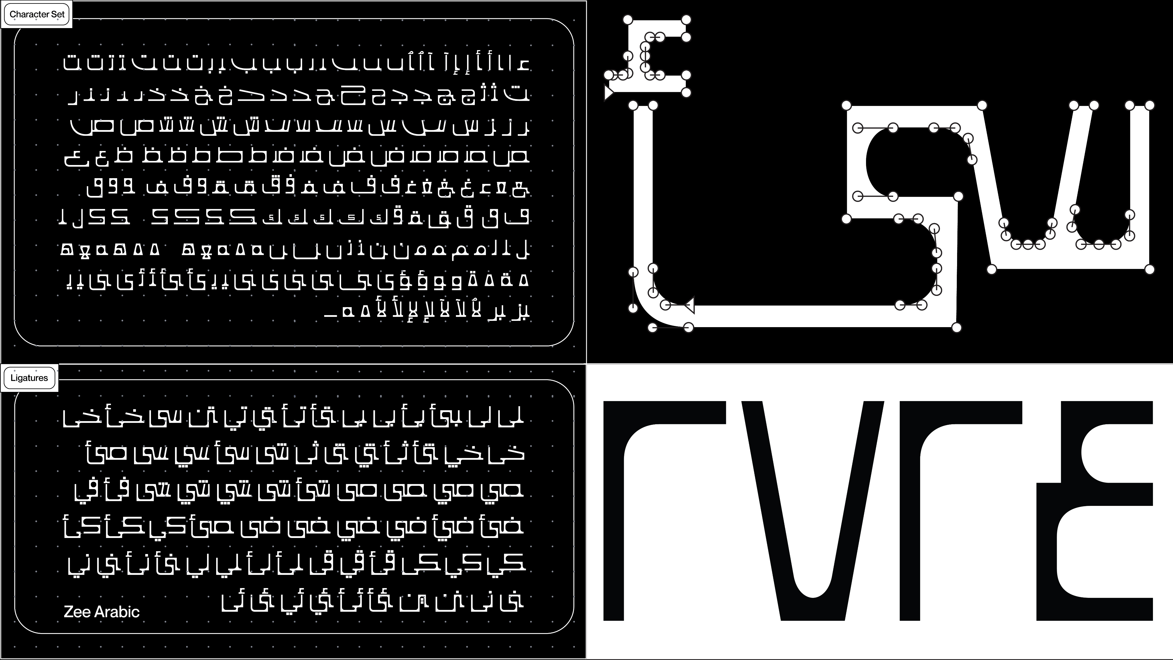
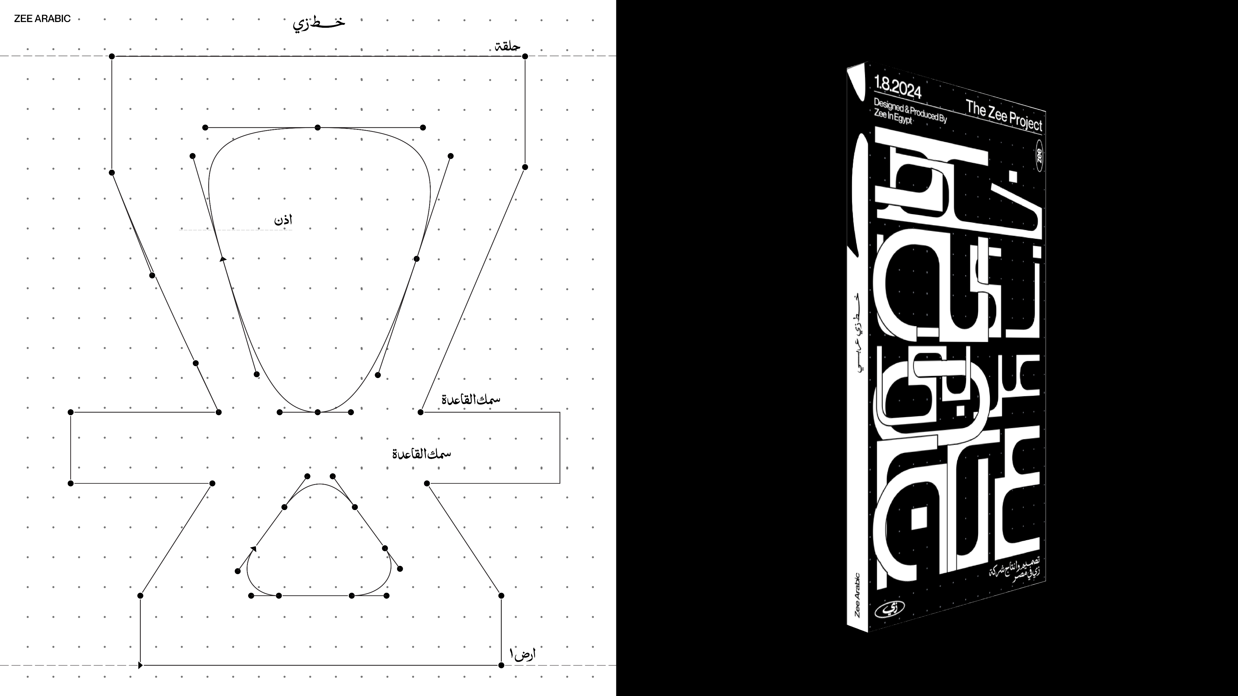
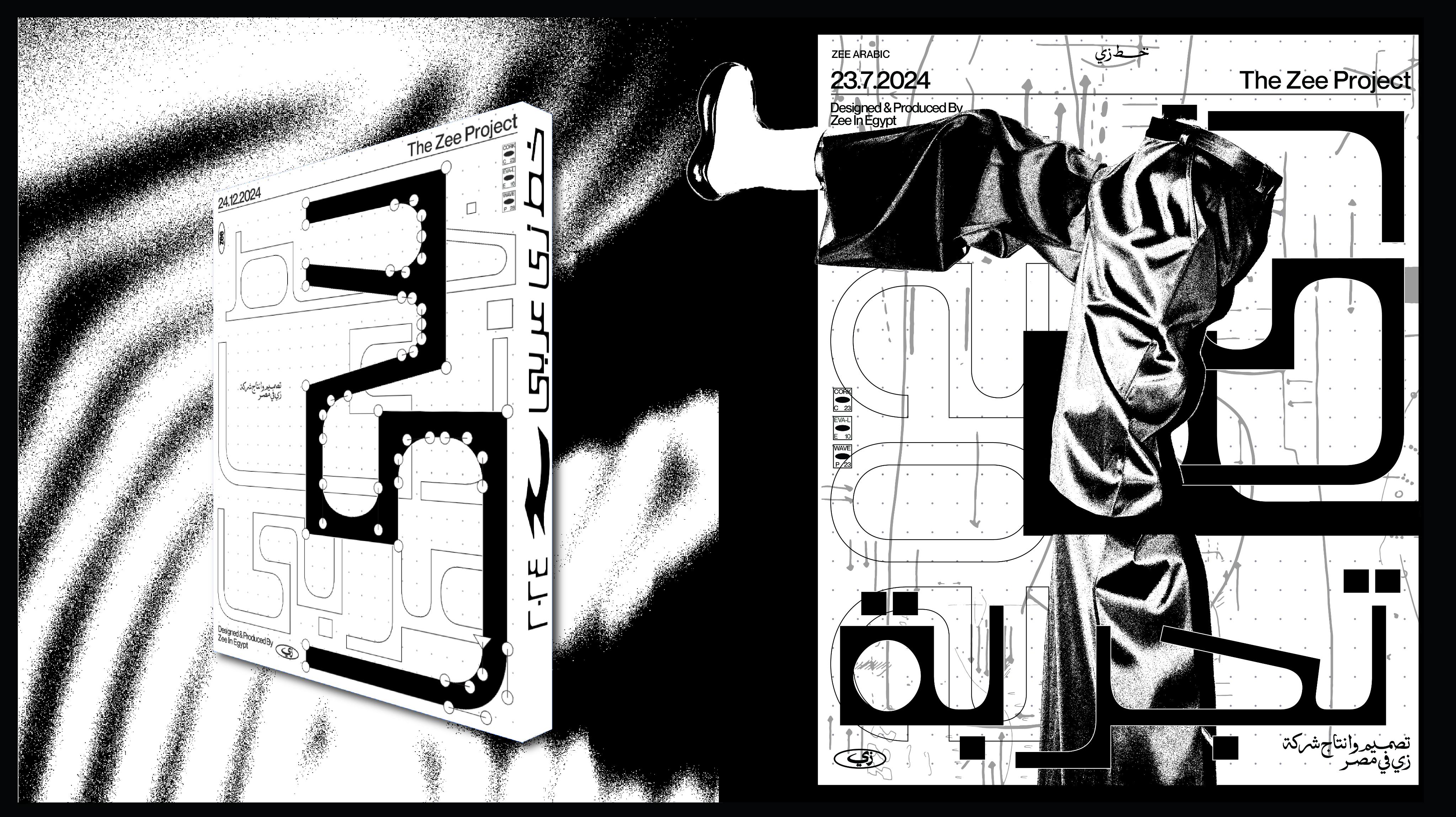
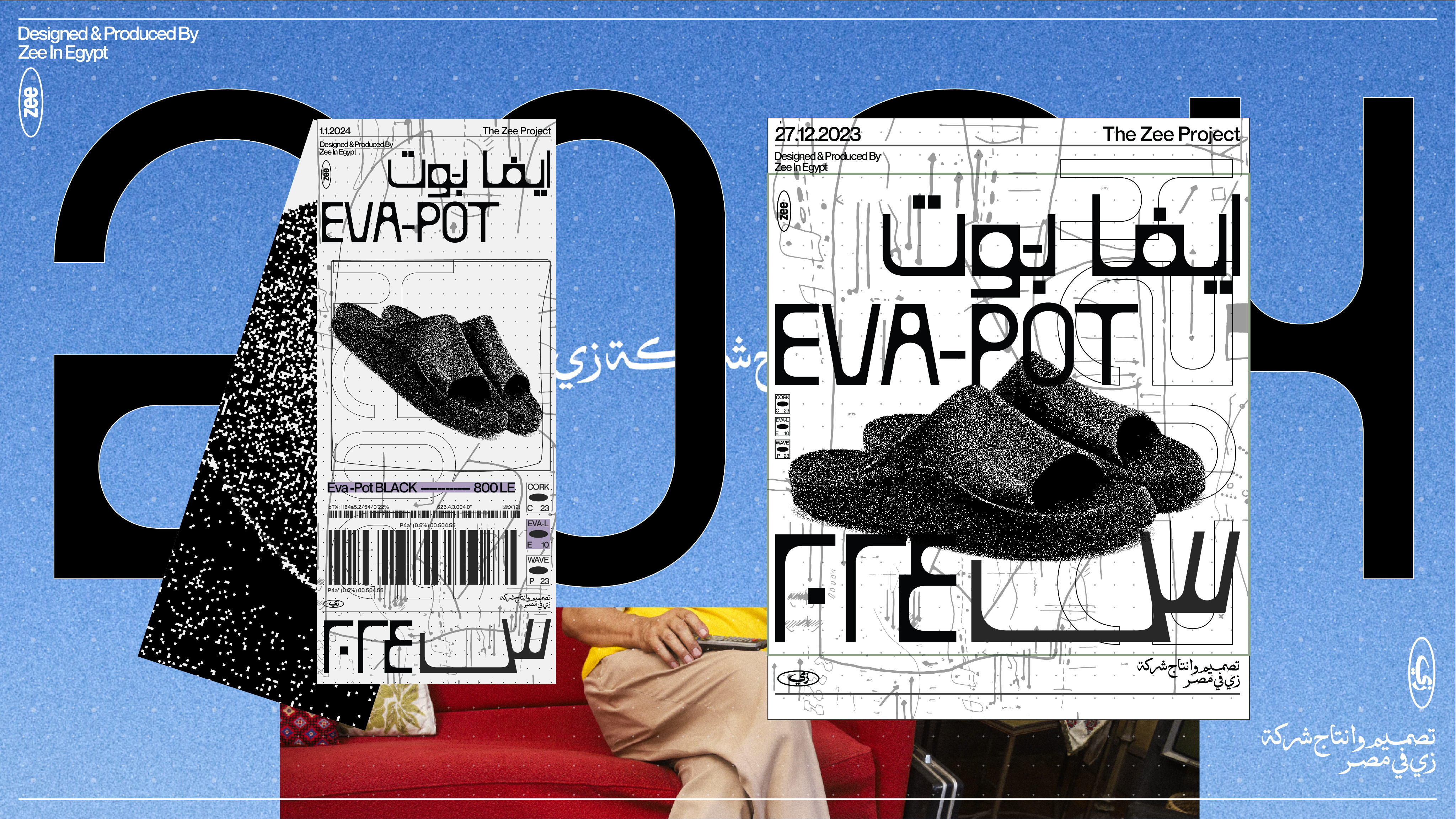
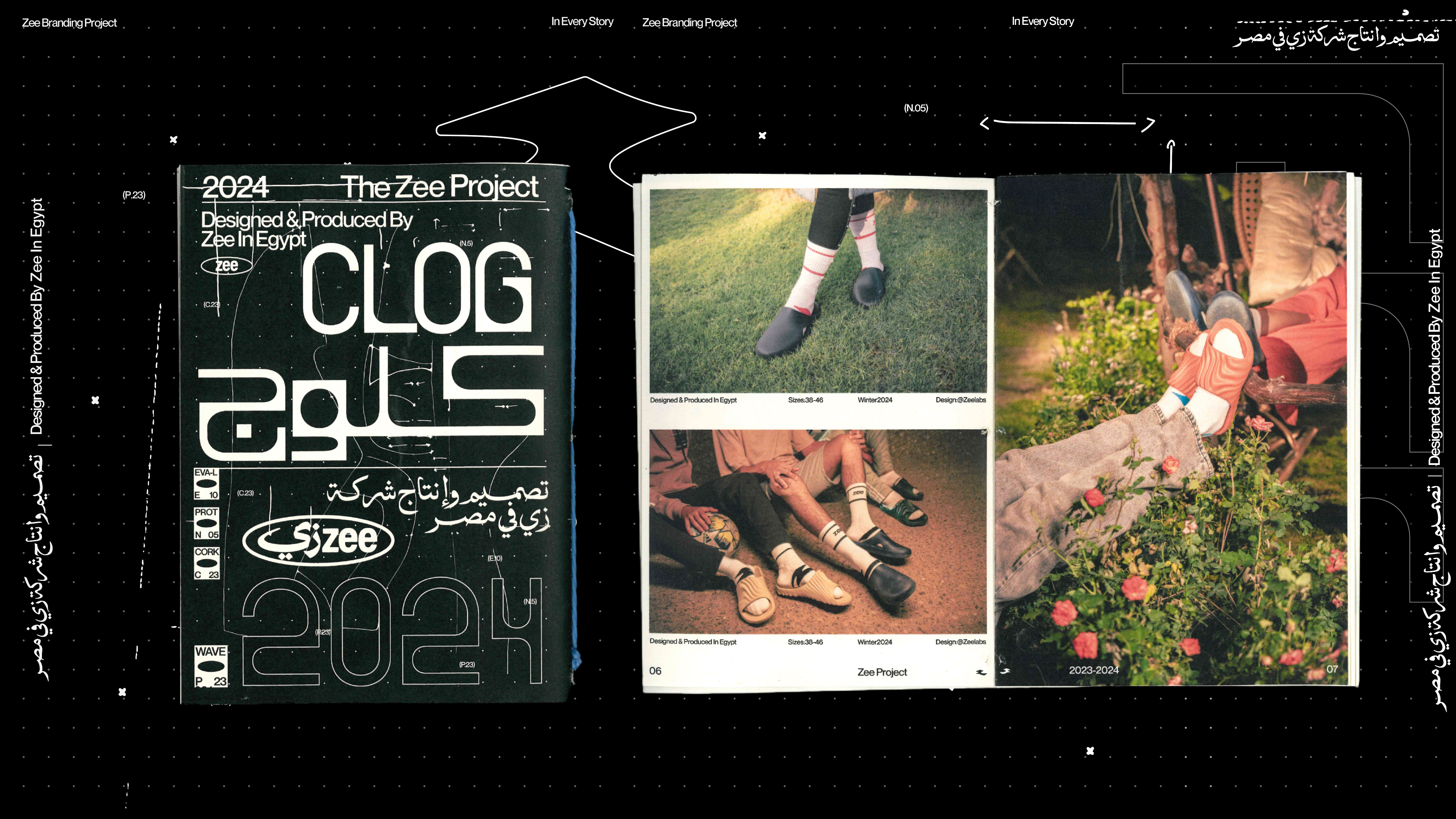
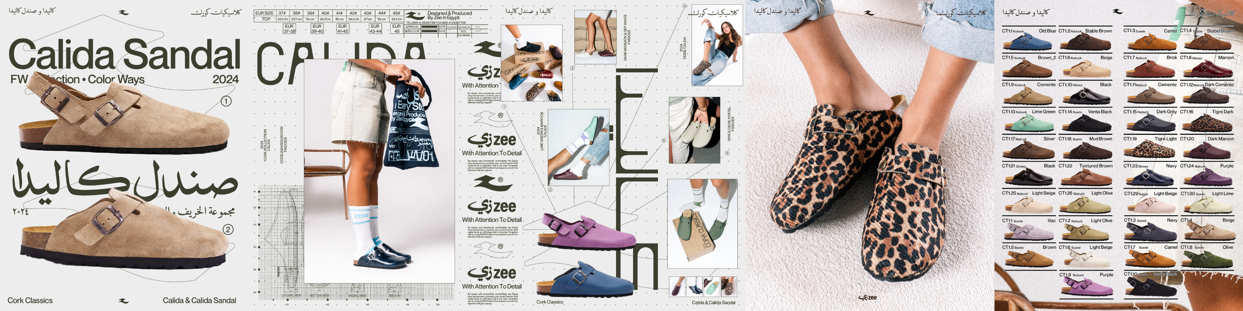
Moshtarak created a compact brand platform and product taxonomy: audience archetypes (Cultured Move-Makers, Athletes, General Movers), a phonetic+color naming system for clear discovery, and a visual+verbal language guided by an Explorer+Creator archetype. The work aligned product thinking, storytelling and community programming so the brand could be both technically credible and culturally magnetic.
Impact
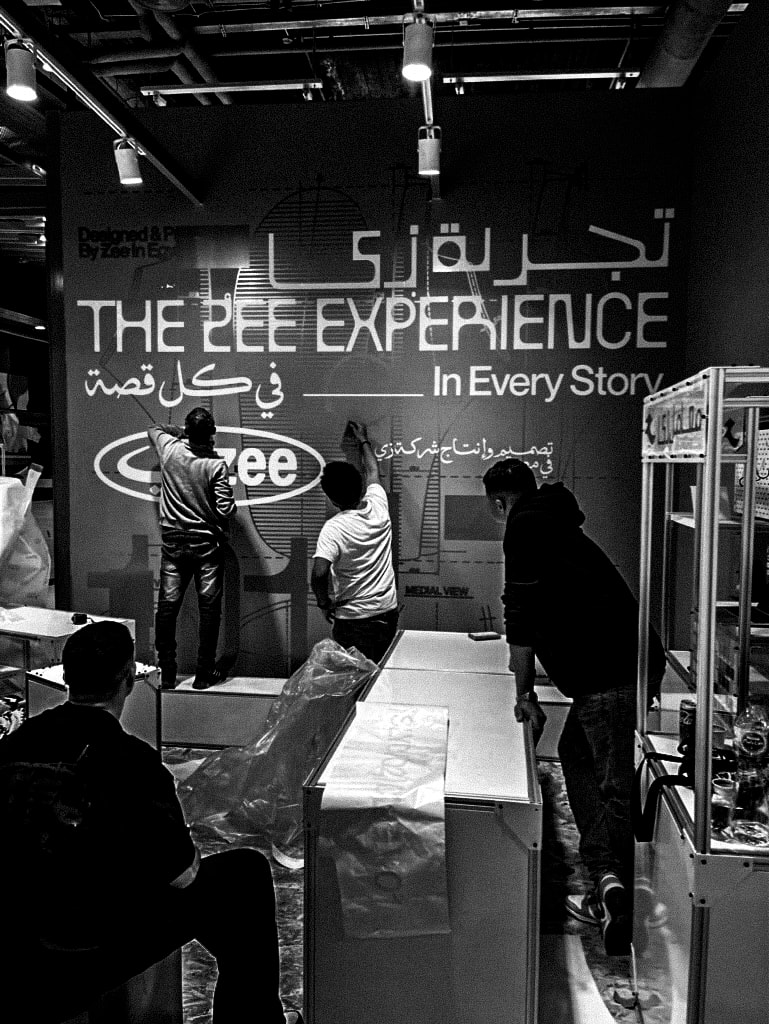
The identity clarified what Zee is at a glance — who it serves, how it performs, and why it matters. The naming and taxonomy made product choice intuitive; community-focused activations rooted the brand in creative networks. Zee launched with a cohesive story that positions it to scale as a human-centred footwear movement.
© Moshtarak Design Studio. All rights reserved.

Work
About
Contact
WERASH
Zee
Zee is a Cairo-born footwear label that marries performance-driven design with timeless aesthetics. Built for creators, athletes and everyday movers, the brand frames shoes as tools for expression — comfortable, durable, and unmistakably original — rooted in a proudly Egyptian perspective.
Challenge:
The market forced a trade-off between comfort and character. Zee needed a product and brand logic that delivered genuine ergonomic benefits while remaining culturally expressive and easy to navigate for shoppers.
Solution :
Moshtarak created a compact brand platform and product taxonomy: audience archetypes (Cultured Move-Makers, Athletes, General Movers), a phonetic+color naming system for clear discovery, and a visual+verbal language guided by an Explorer+Creator archetype. The work aligned product thinking, storytelling and community programming so the brand could be both technically credible and culturally magnetic.
Impact:
The identity clarified what Zee is at a glance — who it serves, how it performs, and why it matters. The naming and taxonomy made product choice intuitive; community-focused activations rooted the brand in creative networks. Zee launched with a cohesive story that positions it to scale as a human-centred footwear movement.
© Moshtarak Design Studio. All rights reserved.
Zee
Zee is a Cairo-born footwear label that marries performance-driven design with timeless aesthetics. Built for creators, athletes and everyday movers, the brand frames shoes as tools for expression — comfortable, durable, and unmistakably original — rooted in a proudly Egyptian perspective.
Challenge:
The market forced a trade-off between comfort and character. Zee needed a product and brand logic that delivered genuine ergonomic benefits while remaining culturally expressive and easy to navigate for shoppers.
Solution :
Moshtarak created a compact brand platform and product taxonomy: audience archetypes (Cultured Move-Makers, Athletes, General Movers), a phonetic+color naming system for clear discovery, and a visual+verbal language guided by an Explorer+Creator archetype. The work aligned product thinking, storytelling and community programming so the brand could be both technically credible and culturally magnetic.
Impact :
The identity clarified what Zee is at a glance — who it serves, how it performs, and why it matters. The naming and taxonomy made product choice intuitive; community-focused activations rooted the brand in creative networks. Zee launched with a cohesive story that positions it to scale as a human-centred footwear movement.
© Moshtarak Design Studio. All rights reserved.
Zee
Zee is a Cairo-born footwear label that marries performance-driven design with timeless aesthetics. Built for creators, athletes and everyday movers, the brand frames shoes as tools for expression — comfortable, durable, and unmistakably original — rooted in a proudly Egyptian perspective.
Challenge:
The market forced a trade-off between comfort and character. Zee needed a product and brand logic that delivered genuine ergonomic benefits while remaining culturally expressive and easy to navigate for shoppers.
Solution :
Moshtarak created a compact brand platform and product taxonomy: audience archetypes (Cultured Move-Makers, Athletes, General Movers), a phonetic+color naming system for clear discovery, and a visual+verbal language guided by an Explorer+Creator archetype. The work aligned product thinking, storytelling and community programming so the brand could be both technically credible and culturally magnetic.
Impact
The identity clarified what Zee is at a glance — who it serves, how it performs, and why it matters. The naming and taxonomy made product choice intuitive; community-focused activations rooted the brand in creative networks. Zee launched with a cohesive story that positions it to scale as a human-centred footwear movement.
© Moshtarak Design Studio. All rights reserved.